
What's With Watchmen's Windsor?
What's With Watchmen's Windsor?
Does the font usage in Watchmen have any meaning?
There’s an odd font that keeps popping up in HBO’s Watchmen, and it’s driving me a little bonkers.
If you follow me on Twitter, you may have seen me tweet about my irritation over the anachronistic font usage in the first episode of HBO’s Watchmen. In case you don’t want to click through to the Twitter thread, I’ll include a bit of it here.
The first episode of Watchmen opens with a silent film about Bass Reeves, in a scene which takes place in the 1920s. The title cards use the font Bernhard Modern, which did not exist before 1937.
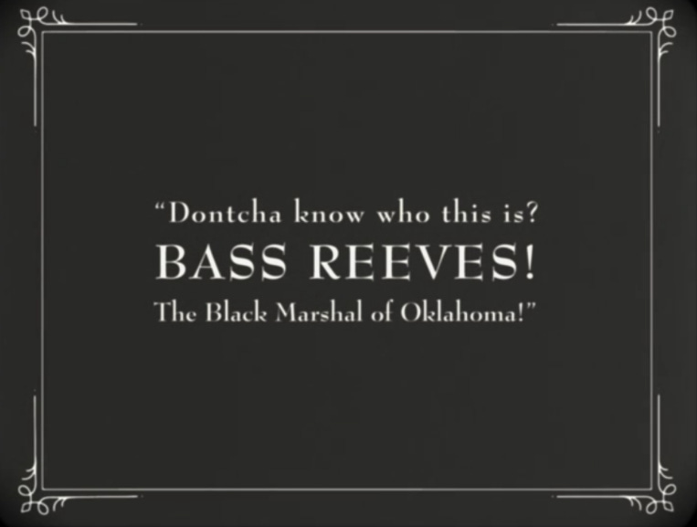
Here is some proof, in case you doubt me.

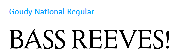
I pointed out that if they didn’t want to look up actual title cards from the time period, or hand-letter the intertitles, they could at least have looked up fonts which existed in the time period, or they could have used digital fonts which mimic characteristics of fonts used for title cards, such as Goudy National Regular, which is based on a font Frederic Goudy designed in 1916 called National Oldstyle and which was—at least according to Bowfin Printworks—actually used in titles for silent movies.
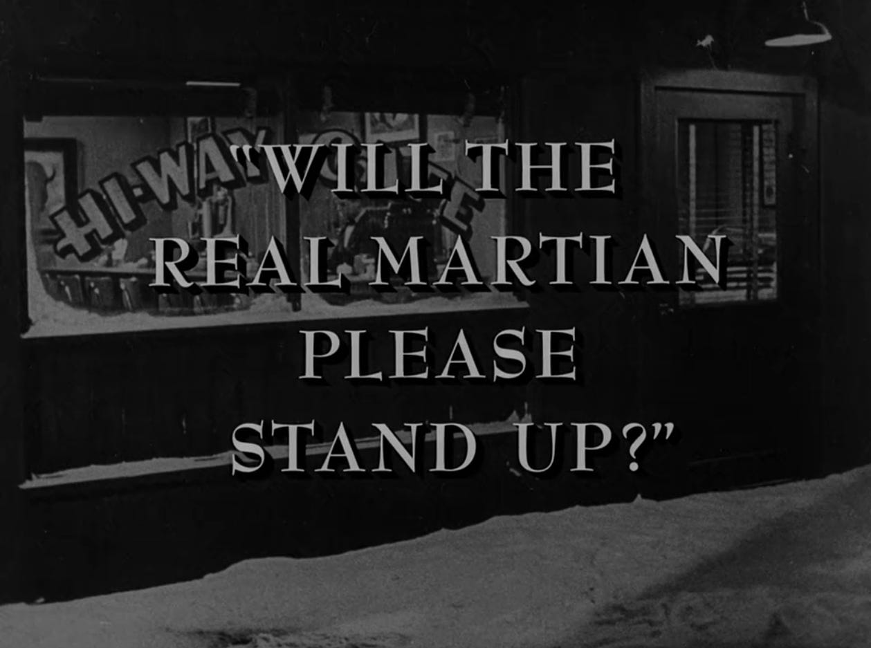
Since posting that, I took notice of another unusual font choice in the series: Windsor. I mentioned in briefly in my breakdown of the second episode, but it’s used on the newsstand and on the German leaflet.

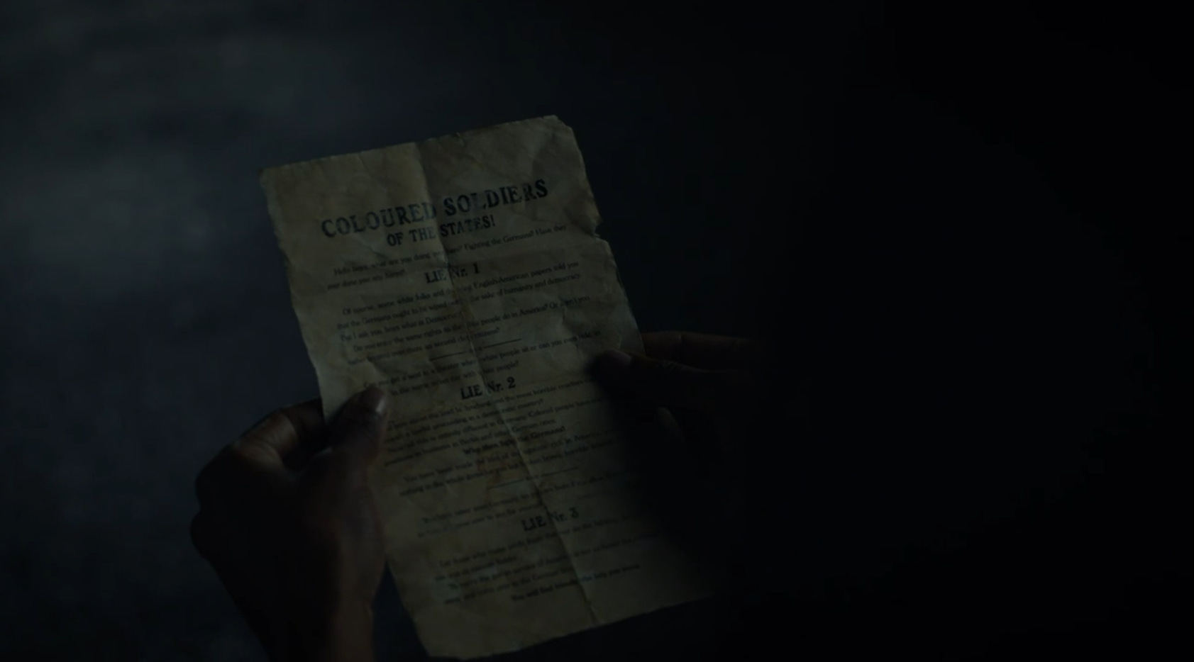
The usage on the German leaflet, at least, appears to be a slightly modified form of the font (it’s difficult to tell, since I’m using a streaming version, but the capital R does not appear to be the usual Windsor “R,” and in fact, I haven’t found any digital version of the font with that capital R in any weight—again, as far as I can tell). If this was modified for the show, that suggests an attention to font detail that I wouldn’t have expected based on the anachronistic Bernard Modern usage. Typically, most shows don’t care enough about graphic design to alter fonts. The only major example I can think of is The Good Place, which uses a modified form of Brandon Grotesque, and which pays careful attention to graphic design more generally (for instance, the web pages look as if they could be real web pages). Is it worth noting that Michael Shur, the showrunner of The Good Place, talked with Damon Lindelof before plotting it out, and that both shows share an executive story editor and writer (Cord Jefferson)? I don’t know.
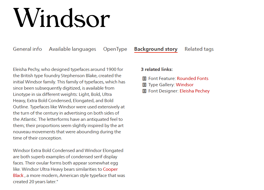
Now, Windsor actually did exist at the time the German pamphlet would have been printed, and it was popular in advertising “at the turn of the century… on both sides of the Atlantic,” according to Linotype. It was designed in 1905, and people really took to it for a time despite (or because of) the oddities of the font.
In fact, earlier today I started watching a YouTube video where a woman looked at “cooking hacks” in an edition of Mrs. Beeton’s from around this time period, and I noticed that on the inside cover there was an advertisement which used Windsor. It was pretty common! This is a good font choice.
But it’s a little odd to see such a distinctive font in two key places, and it’s even odder to see it in a third. In the third episode, Judd Crawford’s tombstone… uses Windsor.

Here’s the Linotype version for comparison:

Three different occurrences of Windsor in a TV show is… strange, and it’s certainly an unusual font to choose for a tombstone. In fact, its usage here calls to mind the Watchmen graphic novel’s own contribution to the history of fonts. Behold, a quick sidebar!
In 1994, Microsoft released a font called Comic Sans, designed by Vincent Connare. According to a 2009 article in The Wall Street Journal, he based the look of the font off of the lettering in two comic books in particular: The Dark Knight Returns and Watchmen.
Comic Sans is widely mocked by people who know just enough to know that it’s funny to mock it and that it’s bad to use the font in serious situations. Mocking it is kind of a basic thing to do, but it’s undeniable that the font is not appropriate for all situations. One of the most notorious examples of an inappropriate usage of Comic Sans is for tombstones and memorials. In fact, Comic Sans tombstones are mentioned in the beginning of the WSJ article.

So is this simply an extremely arcane typographic joke—using a similarly odd typeface for a tombstone as a nod to Watchmen’s influence on Comic Sans? Or is there some sort of linkage we’re supposed to see between all three occurrences? Maybe it’s just the work of a renegade member of the production design team and the only message is “I like Windsor, or at least think it’s funny to use it so much.” Or maybe it doesn’t mean anything. After all, the usage of Bernhard Modern in the first episode was extremely sloppy. Why should we expect some sort of rigor with the usage of Windsor?
Here’s where I have to take a step back: it’s possible that the use of Bernhard Modern wasn’t quite as sloppy as I thought. I realized that the font is used in a classic of weird American television: The Twilight Zone. And by “realized,” I mean that I watched an episode of The Twilight Zone a few days ago and said to myself, “Wait… that’s Bernhard Modern.”
Now, Lindelof is certainly aware of The Twilight Zone. Here’s an interview with him in Entertainment Weekly where he mentions the influence the show had on Lost:

So… that’s neat, I guess. Maybe the font choice had more thought put into it than it initially appears (although they could have made it look less digital).
Anyway, it’s difficult at this point to say what this bizarre insistence on Windsor means—if, indeed, it means anything. My only theory at this point is that we’re meant to link the three occurrences thematically in some way, but that’s not really much of a “theory.” Are they meant to represent (anti-)blackness in the show? After all, the first time we see the German leaflet is in the Tulsa Massacre sequence.
I did briefly skim through the first episode again to see if I’d missed a significant usage of Windsor, and I don’t think I did. But you can bet I’ll be keeping an eye out for it.
If you’d like to subscribe, I’m going to be publishing my notes on Episode Three of Watchmen soon, along with a couple supplemental posts: one where I talk about where I think the show may be going in general and one where I talk about the most famous piece of iconography in the graphic novel.
If you enjoyed this look into the fonts of Watchmen, let me know!
I edited this post to add a "subscribe" button and some copy relating to it.